Students from the MA New Media (UvA), MA Information Science (UvA) and MA Editorial Design (MaHKU) presented their interactive visualization projects at Crea.
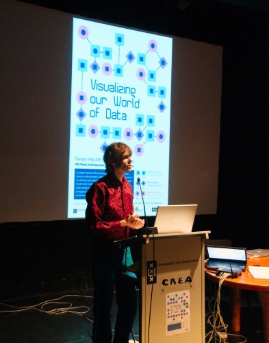
The Visualizing our World of Data program contained eight presentations (not all of them are described here), many of which were based on Flickr. One of the requirements of the assignment was to gather a suitable dataset within a week, which led many students to opt for the easy to use Flickr photos/API.
WorldMinder
WorldMinder was inspired by GapMinder and contains public awareness data. When mapping world data you need an orientation point and a graph is not suitable for that purpose. Instead, data is mapped onto a world map. It is supplemented with a scatter chart and the main interface view shows three sets of data in one single visualization.
The application has several functions:
- As you can see the color of the dots is consistent with the map which makes it easy to locate the plotted data on the map.
- The red/green colors indicate whether or not the number is below or above the average. You can switch between green/red, for example in the case of HIV you would want a number that is above average colored in red as an alarming color.
- In the bar chart you can compare countries.
- In the x and y-axis you can chart different data, you can create your own view.
WorldMinder is a framework for visualizing datasets and for posing new questions. You can map and chart different datasets and pose new questions through combinations. It is meant as a framework and hopefully in the future it would allow you to import your own datasets and map/visualize them. In the current version you can use it to link different types of visualizations and as a framework for posing questions. What is interesting in this application is that there are “dataless” countries. There is no way to see “non-data” in a scatter chart. WorldMinder also shows you which countries have no available data.
On a technical note, WorldMinder used PHP to retrieve the data, Flash to visualize the data and it’s all stacked in layers using JavaScript. JQuery was used for the interaction between the different displays.
WorldMinder works fine with: Safari 4.0 beta & Firefox Mac/Linux.
Political Discourse Bubbles
This project reminded me of the ‘US presidential speeches tag cloud’ by Chirag Mehta. The main difference is that it shows all the political parties in the Netherlands and words frequently used in their party programs in order to show their political discourse.
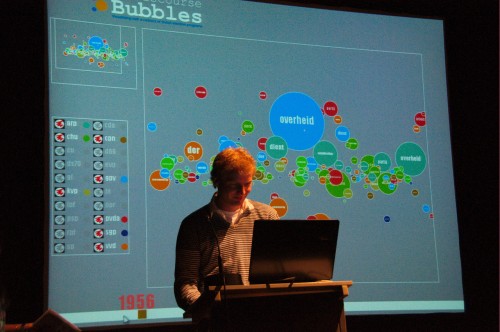
One of the most interesting uses of this project is the feature to map a discourse over time. How has a party program changed and which issues lose or gain attention from political parties? On a small critical note I would like to point out that there is quite some noise in the early periods. The old Dutch way of spelling “the” “and” and all these small words that are filtered out in the tagclouds do appear in the early periods with their old spelling.
New Media Events
New Media Events (Firefox and widescreen only) shows you pictures taken during so called new media events such as The Next Web and the Web 2.0 expo. The team described the application as a way of socializing but I don’t socialize with other new media event visitors through such applications. There are plenty of existing platforms that allow for direct interaction and the sharing of pictures such as Twitter in combination with Twitpic or Mobypicture.
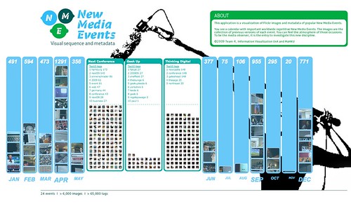
Currently it is a New Media Events calendar which may serve as an archive. New media events are added by the team itself and photos will only appear if tagged appropriately.
Global Party Viewer
The Global Party Viewer aims to visualize events occuring in a specific place in the world on a specific time using Flickr images and their metadata. The application distinguishes between different types of music (rock, classical, techno) but is able to map events with different music types onto the same location by creating an overlap. The GPV is based on the premise of: the more popular the party, the more pictures are shown. With the increase in camera phones and GPS that provide location aware pictures such visualizations will be come richer and richer.
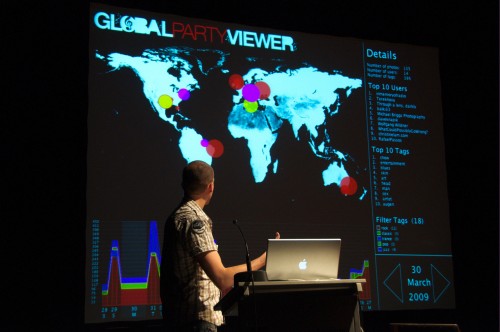
It would be interesting to coorporate with event planners that integrate Flickr pictures such as Upcoming.org which provides specific event tags that may be used by Flickr users.
Shotspot
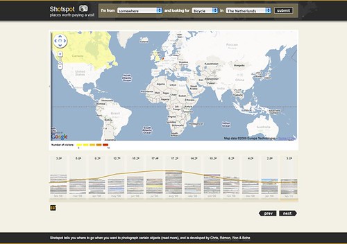
ShotSpot shows you places worth a visit through the lens of Flickr. It maps specific Flick images (eg: tagged with ‘bike’ – it currently only takes English tags) and places them on the map if the user has geolocated the image. As a visitor, or tourist, where do you go if you want to see a lot of windmills? It also maps the number of pictures taken from a specific object over time which allows for questions: Where do I go in February to see beautiful waterfalls?
Unfortunately using pictures taken at a specific time as a measure for a popular destination disregards the fact that people with jobs usually go on holidays in December or July-August which will cause a rise in the number of pictures. ShotSpot does look at the unique number of visitors for a specific destination and not at the amount of pictures a user uploads during that time.
Another interesting measure for popularity would be Flickr’s own interestingness. Interestingness is based on the number of views and the number of comments. As noted by Prof. Roger Rogers another interesting Flickr specific feature to look at would whether or not the user has a pro account.
ShotSpot (Windows Only/Firefox or Chrome browser – Also works on my Mac with Firefox)
http://www.ronkok.com/work/infvis/pub/
Other projects
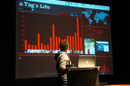
PhotoTrail, Zoom into the Zoo, World through my Eyes and “A Tag’s Life” by Daan Odijk.
Previous projects
Two blog postings about last year’s projects / presentations:
http://mastersofmedia.hum.uva.nl/2008/05/22/visualizing-the-network/
http://www.latebytes.nl/archives/2008/05/een-gevisualise.html
Photos by Ork de Rooij.

Thanks for covering the event Anne! And you’re right Shotspot does work on Mac (Firefox and Safari).
Cool stuff! I’d have loved to be there.