Several services allow you to create graphs from search results within blogs.
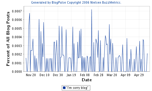
The first one is created by Nielsen BuzzMetrics’ BlogPulse and graphs “I’m sorry blog” over a period of six months.

"I'm sorry blog" as graphed on May 12, 2007 by BlogPulse.
A few things about this graph:
- BlogPulse gives 177 results for “I’m sorry blog” but despite the use of quotation marks BlogPulse is not returning exact results. This casts a big doubt over the accuracy of the search results and the graph. This makes it hard to interpret peaks and lows in the graph.
- BlogPulse only indexes results from blogs that have submitted themselves to BlogPulse. BlogPulse is currently tracking over 46 million blogs, which is about half of what Technorati is tracking, which is not a complete coverage either.
- If the results are not quite accurate than the percentage of all blog posts that contains the phrase “I’m sorry blog” is even lower than 0.0007% It would be interesting to use different search strings but since search results don’t seem to be accurate I’m not sure if that would give me better results.
- I would prefer “The number of times mentioned” on the Y axis instead of a percent of all blog posts.
- BlogPulse does not graph search results that date from over six months ago. BlogPulse started in May 2004 so this option to date back up to six months ago is a conscious decision. I would be very interesting to graph blog results over a longer period of time but blogging seems to be about freshness and everything that happened over six months ago isn’t fresh.
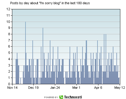
The second graph by Technorati also depicts “I’m sorry blog” over a period of six months.

"I'm sorry blog" as graphed on May 12, 2007 by Technorati
A few things about this graph:
- Technorati gives 627 results for “I’m sorry blog” but despite the use of quotation marks Technorati is not returning exact results, just like BlogPulse. This casts a big doubt over the accuracy of the search results and the graph.
- Technorati is tracking about 80 million blogs, which is quite a lot but it is not a complete coverage.
- Where there is a big peak around November 20, 2006 in the BlogPulse graph there seems to be a gap in the Technorati graph. Does Technorati index completely different blogs than BlogPulse and did Technorati’s blogs not mention it once?
- What do the numbers on the Y axis indicate? The number of times the search phrase was mentioned in a blog? Very likely, but it would be nice if Technorati would name the X and Y axis.
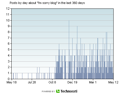
Technorati does offer the ability to graph search results that date from a year ago:

"I'm sorry blog" as graphed on May 12, 2007 by Technorati
This is an interesting graph. What happened after October 8, 2006 that accounts for the sudden rise? Did more people start to apologize? Maybe, but as noted before the accuracy of the search results is doubtful. Did Technorati start to index more blogs? Definitely, because in May 2006 it was indexing about half of the 80 million blogs it is indexing now as stated in Sifry’s Alerts: The State of the Live Web, April 2007.
The name “The Live Web” is another indicator that what is important is what is happening now. If you search for “I’m sorry blog” on Technorati the first result is the blog that was last updated, in this case three hours ago. The last search result is the blog thatwas last updated, in this case 180 days ago. Technorati has been indexing since 2002/2003 and is able to return graphed data from over a year ago but does not return search results that are older than 180 days. Freshness is the new black.
Anne,
I’m trying to understand what you are attempting to do by search for the exact string “i’m sorry blog”. You mention that it doesn’t do an exact match. This is common for search engines when ‘stop words’ are included in the search or in the results. For example, the token “i’m” will be dropped. In addition, matches will hit for posts which include stop words – like “i’m not sorry”.
If you search for a non stop word phrase, like “american troops” you will see that BlogPulse does correctly match this exact phrase.
You state that BlogPulse only crawls blogs that have been submitted. I’m not sure where you got this from, but BlogPulse actually crawls as many true blogs as it can – it doesn’t require a blog to be submitted.
Finally, any graph that it giving back such a small count cannot really be used as a reliable source of statistics for trends.
Thank you for your reply. As I am no expert in data mining at all this was more a general experiment. I attempted to find out wether or not apologizing to one’s blog is a general issue in the blogosphere which stays fairly consistent over time. I now realize that this is not the right way to do it because this kind of data does not allow for this kind of analysis. First because stop words are dropped thus not returning the results I am looking for. Second because a qualitative analysis may be better better suited for a single blog instead of a big set of blogs. To research how often a blog author apologizes to his blog, does this affect post frequency, will he post more frequently after apologizing and then turn to a qualitative analysis which might include motivation.
My main interest is that bloggers who apologize to their blog, in contrary to their blog audience, seem to consider their blog to be a self sustaining unit that is out “there” waiting for them. They vitalize the blog by attributing almost humanlike attitudes and qualities to it. I am still looking for a good approach on how to deal with these questions but this is definitely not the way to do it.
You might find this article on ‘Methodologies for Mapping the Political Blogosphere’ interesting. http://www.firstmonday.org/issues/issue12_5/bruns/index.html
Thanks. I am almost done with my obligated, yet interesting, reading so it will be on top of my “to read” list :)
I just noticed you posted it for me on del.icio.us as well which brings me to the next issue…